
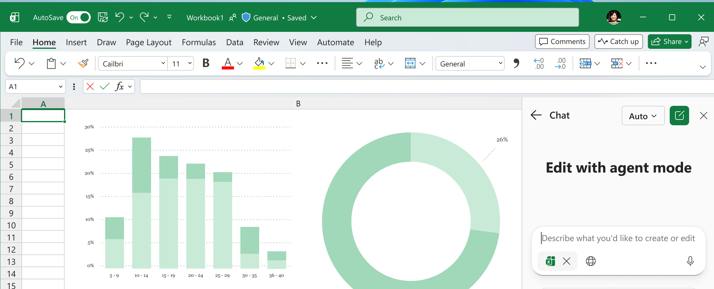
Microsoft has announced a new capability on the Microsoft 365 Roadmap called Excel canvas, slated for general availability in September 2026. This feature enables Microsoft Copilot to transform raw workbook data into an interactive, visual dashboard displaying key metrics and insights.
What is changing?
Rather than manually creating individual charts, pivot tables, and KPI cards, users will be able to ask Copilot to generate a dedicated canvas view. This canvas stays connected to the underlying data source, automatically updating whenever the workbook data changes. If the layout or visualisations need refinement, users can modify the canvas using natural language chat with Copilot.
Who does this affect?
This update will benefit anyone who relies on Excel to present data and communicate performance, including finance teams, project managers, department leads, and operational analysts. It bridges the gap between raw spreadsheets and formal presentation dashboards, reducing the time spent building routine reports.
How teams can prepare
Although the feature is scheduled for late 2026, organisations can prepare their teams and data practices now:
- Standardise data formatting: Copilot works best with well-structured data. Ensure your team uses proper Excel Tables with clear column headers and consistent data types.
- Develop prompt literacy: Help staff get comfortable using conversational prompts to query data and direct Copilot effectively across Microsoft 365 apps.
- Review governance and licensing: Ensure the appropriate users have access to Copilot licences and understand data security permissions within shared workbooks.
To help your organisation get the most out of these modern tools, explore our practical, instructor-led Microsoft 365 and Copilot courses at 3grow training.